
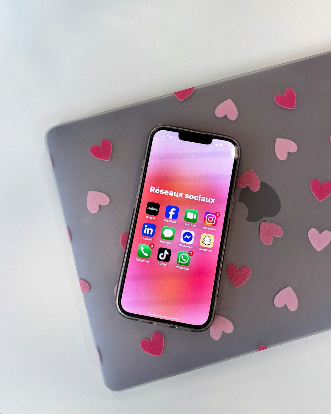
You’re on your phone. You’ve got 3 minutes. Maybe you’re waiting in line or just avoiding a boring moment. You open an app, and boom — it instantly grabs your attention. Fun! Fast! Interactive! That magic? It’s called quick play and micro-interaction design. And it’s the secret sauce behind addictively good mobile content.
TLDR
Quick play and micro-interactions make mobile content more fun and engaging. They let users do something cool in just a few seconds — no big commitment needed. Well-designed micro-moments build habit, keep users happy, and make apps feel alive. If your app is slow or clunky, people bounce fast. These features help you hold attention.
What is Quick Play?
Quick play is all about jumping into action — fast. No long tutorials. No startup screens. Just tap and GO. This concept started in gaming but now lives in all kinds of mobile apps:
- Mini-games inside larger apps
- Instant news snippets
- Swipe-based dating apps
- One-tap video stories
People want to do something the second they open your app. Quick play lets them win a level, swipe on a match, read a joke, or flip through info — in seconds.
What Are Micro-Interactions?
Micro-interactions are the tiny details that give apps personality. They’re the little things that react when you do something. Think:
- A heart that bursts when you like a post
- A button that jiggles if you press it wrong
- A swish as a task completes
These sound small, right? But they make your app feel alive. When done right, users don’t notice them — they just feel good. That feeling brings people back.
Why Do These Tiny Things Matter?
Today’s mobile users are fast. Really fast. They scroll, tap, swipe, and ditch — all in under 5 seconds. You have to connect with them immediately.
That’s where quick play and micro-interactions shine. They’re small pieces of delight that:
- Lower friction — No long waits or big choices
- Increase engagement — Users want to “just do one more”
- Feel good — Feedback makes actions satisfying
- Drive habits — People come back for daily bursts
Real-World Example Time!
1. TikTok
The app opens directly to a video. You scroll. You laugh. You’re pulled in — instantly. That’s quick play! And when you double tap to like? The heart pulses just a bit. That’s a sweet micro-interaction.
2. Duolingo
Each language lesson feels like a game. Quick play? Absolutely. You learn and earn gems in minutes. Plus, that Owl cheers you on with animations. Little reward animations = micro-interactions. Fun and addicting!
3. Tinder
Swipe right, swipe left. No typing or searching. That’s quick interaction at its core. And the card flip or vibration on super likes? Yep — micro-interactions.
Tips for Designing Great Quick Play Moments
If you want users to dive into your app in seconds, follow these tips:
- Remove extra steps: Skip sign-in walls or lengthy intros.
- Use smart defaults: Choose the most likely action for them.
- Offer a satisfying goal: Even if it’s tiny — like a badge or a “Well done!”
- Restart instantly: When the moment ends, offer another instantly.
Tips for Killer Micro-Interactions
Small doesn’t mean unimportant! These little animations and responses are key to a polished feel. Some design tips:
- Provide feedback: Always let users know something happened when they tap.
- Use emotion: Add playful bounce, color shifts, or sound.
- Keep it fast: Interactions should complete in under 500 milliseconds.
- Stay subtle: If it’s too loud or flashy, it gets annoying fast.
Where to Use These Features
You don’t need a big mobile game or social platform to use quick play and micro-interactions. They fit almost everywhere:
- News apps: Let readers swipe headlines like stories.
- Fitness apps: Offer a one-minute stretch anytime.
- E-commerce: Let users tap to “try on” products quickly.
- Education: Use flashcards or daily quizzes to boost time-on-app.
The rule? If your app involves content or user actions — quick play and micro-moments will boost engagement.
Challenges to Watch Out For
Of course, not everything about this is easy. Here are a few common mistakes to avoid:
- Too many effects: Be careful — animations can slow things down or feel distracting.
- No reward: Tiny interactions still need closure — some kind of feedback or “win.”
- Not testing on real users: What feels cool to you might annoy users. Test and adapt often.
Why It All Feels So Good
It turns out our brains love small victories. Each tap that gives feedback or quick reward? It triggers your brain’s dopamine hit. That’s the same “feel good” response from achievements, jokes, or even tasty food.
It’s not magic. It’s design psychology. And it’s why the most engaging apps feel like mini theme parks: delight behind every corner.
The Future: More “Play” in Everyday Apps
Looking ahead, we’ll see more apps adding playful design — not just games. Banking apps already add confetti when you save money. Meditation apps now give instant visual rewards after 60 seconds of focus. The trend is here: Fast. Fun. Feedback-driven.
This isn’t just about kids or entertainment. It’s smart UX. It’s what keeps attention in a mobile world that’s overloaded, noisy, and scroll-heavy.
So, What Should You Do?
If you build or design for mobile, think about this:
- Can users do something enjoyable within 5 seconds of opening your app?
- Are your buttons and tasks giving satisfying feedback?
- Is there playful design that adds emotional joy?
If the answer is no — you may be missing out on major user stickiness.
Wrap-Up: Delight Is the New Normal
We don’t just want tech to work. We want it to feel good. Fast responses. Tiny wins. Visual joy. That’s what users expect now. Quick play and micro-interaction design aren’t just extras — they’re essentials.
So don’t just build features. Build delight. Make it fast, make it fun, and make it feel alive.
Your users will thank you — with their time, their taps, and their loyalty.