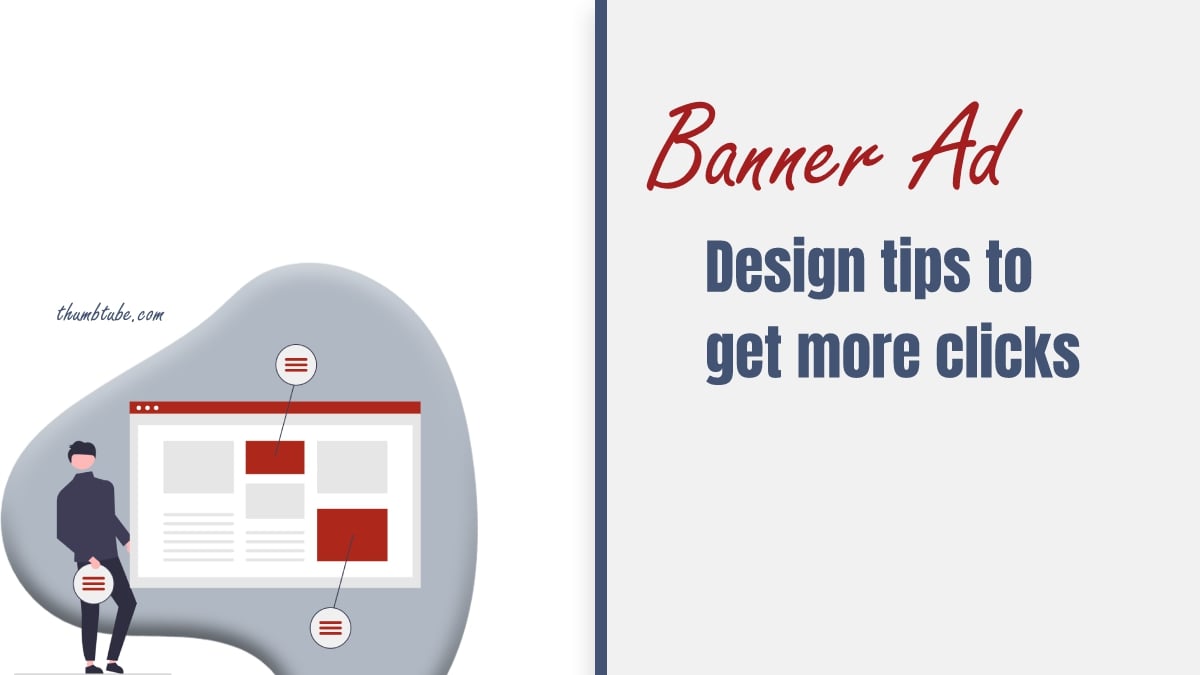
Banner ads are one of the most efficient marketing tools that you can use to promote your business. However, this is a fight for the audience, just like any other marketing technique. But in the case of the banner ad placements, you should catch the audience’s attention almost immediately.
That is why your banner ads should have an impeccable design. This is the only way to catch the attention and drive more traffic to your website. Here are some of the best design advice that can help you design efficient banner ads.
Choose the right size for your banner
According to AdSense, certain ad dimensions perform well. So if you want great results, next time, maybe you can try some of the next dimensions.
Suitable dimensions for an ad banner:
- Medium rectangle: 300×250
- Large rectangle: 336×280
- Leaderboard: 728×90
- Half-page: 300×600
So depending on the space you have reserved for your ad, you will know the right size of the ad banner. Further on, you will need to work on the design and layout – this is just a technical element and the guide that will help you elaborate your design further. You can try doing in on your own or using a banner generator.
Follow the Hierarchy
Effective banners are the ones that drive traffic to your website and increase brand awareness.
To have your banner laid out efficiently, follow the upcoming steps:
- Include your brand logo – Your brand logo should be visually dominant. But also, the logo shouldn’t be more paramount than your CTA or the message you want to share.
- The value proposition – This is the product you are showcasing and the offer you are giving away. This should be the first thing people see when your ad shows up.
- CTA – Be clear and concise, and direct to the point. Tell your potential customers what you want from them.
Keep it simple
You do not want to include many details on your ad banner. Keep your design simple and ensure that the most important details stand out. Keep in mind that the viewers will only glance at your ad, so make sure you catch their attention.
Stand out
As we said, viewers will probably only take a glance at your ad, so you must get their attention. There are a couple of things you should do. Use the various font sizes for your ad copy. The main message or your headline should be written in the biggest font. In general, all copy should be four lines or less.
Do not use scripts fonts or small font sizes (10 pt or less, unless it is a disclaimer or some notice). Also, avoid heavy fonts, all uppercase letters, and extremely thin font sizes.
Use In-Ad Animation
Statistics say that animated banners perform better because they catch the eye faster than static ones. But the key here is not to overdo it. Use simple animation that doesn’t last longer than 15 seconds and doesn’t change more than 3 times.
Choose right colours
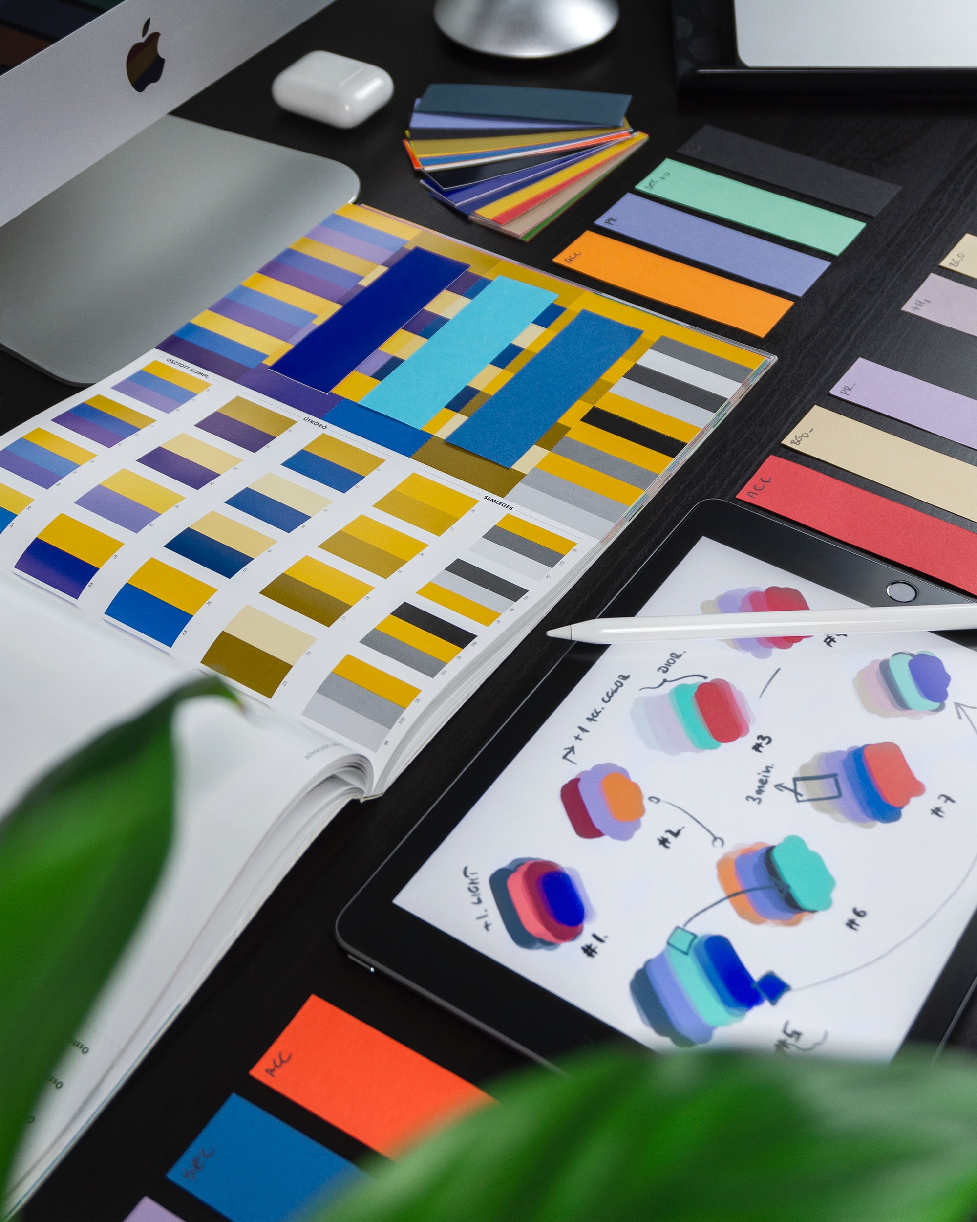
Colours are a great tool to provoke a reaction and attract attention. However, you should be using them cleverly to increase awareness and avoid mixed feelings toward your ad.
Here are the meanings of some of the most used colours, so think about what you want to share in your next message:
- Red – means passion, love, anger, excitement. This colour is attractive to most customers, but if you are having an elegant and mature look, you should stay away from using it.
- Orange – stands for playfulness and energy. This is a great colour to be used as a CTA because it symbolizes invigorating feelings.
- Yellow – means cheer and happiness. This colour is very eyecatching and sends the message of youthfulness and cheerfulness.
- Green symbolizes freshness, health, growth, new beginnings, nurturing, and environment.
- Blue appears in more than half of the logos and symbolizes safety, trust, clarity, serenity, intellect, and maturity.
- Purple stands out as a luxury colour and symbolizes elegance, royalty, wisdom, magic, and feminity.
- Pink – love sweetness, youth, and babies.
- Black – power, exclusivity, luxury, elegance.
- White – symbolizes purity, cleanliness, innocence, simplicity, and honesty.
- Brown – wood, nature, earth, seriousness, masculinity
- Gray – means neutrality and practicality. Gray is a good option for a background colour because it will intensify all other colours on your banner.
Export your images in the correct format
JPEG, PNG GIF, or HTML5 are the formats you should use to save your ad banners. If you use these formats, you will be able to place the ad banner on this website easily. Also, file size is important – you want the ad to load fast on the website. Otherwise, people will miss it. According to Google Adwords, anything under 150 KB is acceptable.
Put the CTA in the button
If you place your CTA in some kind of a shape (oval or rectangle, for example), people are more likely to click on the ad. This is because you are drawing more attention to your CTA.
To wrap up
These are some of the best practices you should follow, but you have to know that designing an efficient banner ad is science. It takes some time to create clickable and high-performing ads. So if you are not a designer, you should also think about hiring one for the creation of your banner ads designs. We believe it will pay you off.