The reality is that despite the major advantages digital design provides, some bad designs can still go viral for a variety of reasons. These reasons can range from the design being executed poorly to an aesthetic being prioritized over function.
And even if a designer does their best to make a mistake-free logo, it is always possible that some people won’t like it. There are a lot of good reasons why logo design can be tricky, particularly when it comes to newbie designers.
We believe that one of the best ways to teach people is through examples. So, in this article, we will show you how you can create better logos than the ones you often see paraded on Reddit or Facebook.
Step 1. Come up with keywords that represent your brand
Brainstorming is an awesome method to make your logos shine! When it comes to logo design, you should start with a list of keywords that represent your brand. It doesn’t need to be a comprehensive list but rather one that is meant to help you identify logo elements to include.
Step 2. Play around with colors and fonts
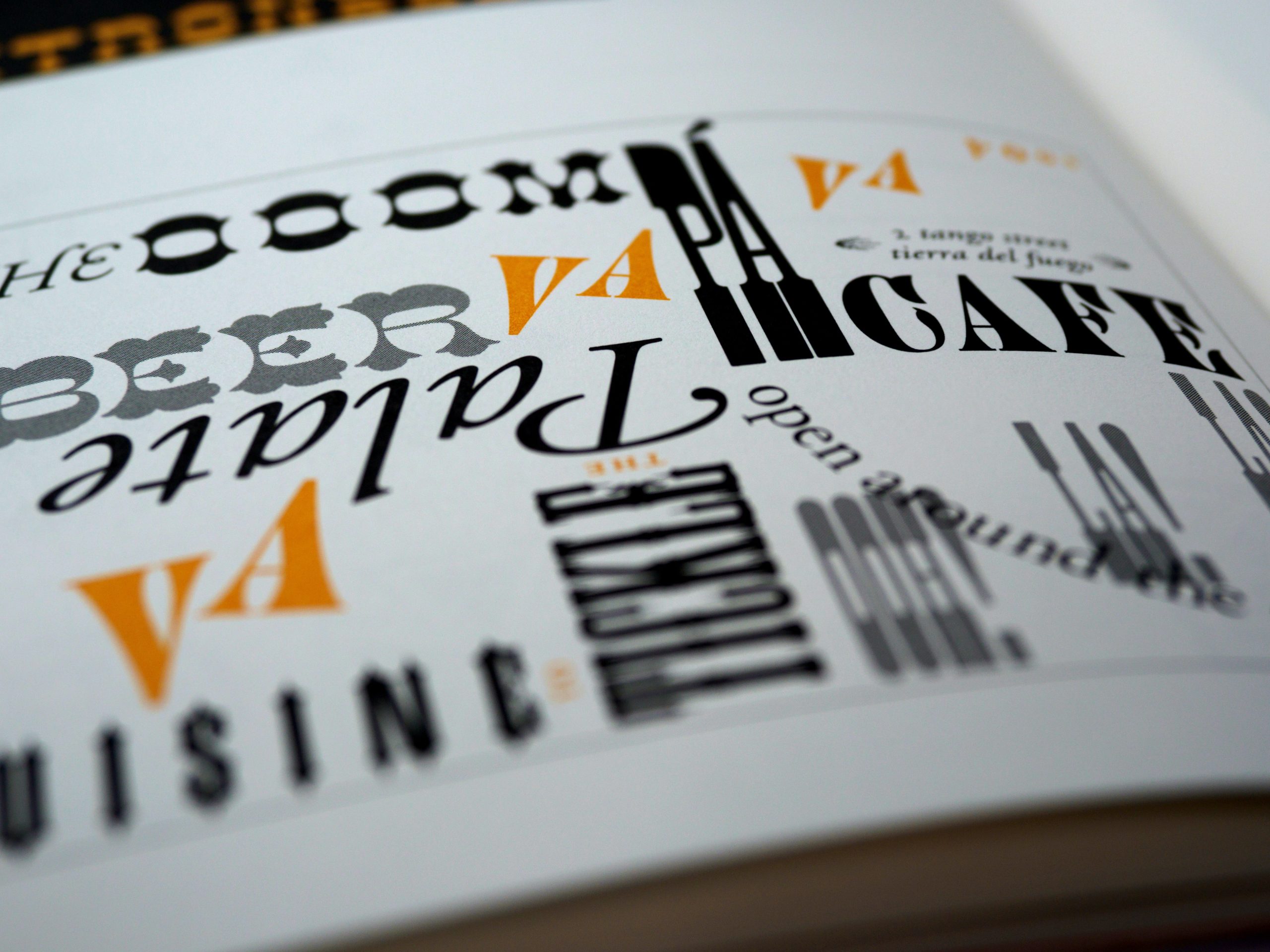
Once you have identified the keywords, think about how each font fits your overall aesthetic and whether or not the font you’ve chosen is easy to read. When it comes to fonts, the main thing to keep in mind is the rhythm and the balance between capitalization and formatting.
The same thing applies to colors. Chances are, you don’t need to use every color of the rainbow when designing a logo, but you should explore them to get a sense of which colors work best in combination.
Step 3. Feedback is very important in creating a logo
Everything is a matter of opinion. What matters most is to get feedback from other people to make sure your logos represent you in the best way possible. Otherwise, you risk sacrificing the quality of your design.
Step 4. Learn more about your customers

If you are creating a logo for an industrial, scientific, or medical industry, for example, it is highly likely that you need to know more details about that profession. If your customer works in the IT industry, you do not have to waste a lot of time trying to understand what makes your competitor’s logo so amazing.
Understanding your target audience means getting familiar with their needs and wants and, therefore, their aesthetic preferences. Some designs use this to their advantage and communicate the industry their in through design.
Step 5. Real-world application
The last step in bettering your logo is to take all of the aforementioned steps and apply them in the real world. Once you create your first logo, your chances of seeing it have a lasting influence are quite high. That’s why it is a great idea to create a few versions of your logo. This is also a great way to practice how you would implement the tips above.
You want your first logo to stand out, no? Take it out for a test ride, and see how people react to it on Instagram or other social media sites. You can also do some light research to see what’s trending and use it as inspiration.
In the end
Whether you are an aspiring designer or a professional with 10 years of experience, I guarantee you can learn something valuable from this guide. In the end, logo design is all about conveying your message to the audience, and that is something you need to master if you want to be a success.