If you care about providing an excellent user experience, you must link pages on your website. Having properly labeled links also helps with search engine optimization. To get people to click on your links, you need to make them look right.
Links are often classified as either internal or external. People are taken to a new website when they click on an external link. Inbound links are those that take users to another page but on the same website.
On-click popup forms, also known as plugin popups, appear whenever a user clicks a link, icon, or image on your site. When you click on a link, the destination website will either take over the active window or open in a new window. Popups usually appear on websites when a visitor arrives or is about to leave.
There is an easy way to include popups. One WordPress plugin – WP Links, is all that is required. However, having users visit your website is essential for popups to be effective. This assumes, of course, that they create a high-traffic WordPress site.
WP Links – Popups
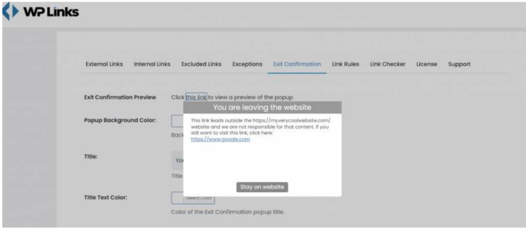
Once the WP Links plugin has been installed and activated, you can adjust the settings. All of your site’s link settings can be managed from here. Rules and visual styling for links can be customized, along with exceptions and functionality checks. The exit confirmation tab is where you’ll want to go if you want to make a popup.
At first glance, it may appear there are many options. But, you won’t need to spend hours configuring the plugin; it will begin functioning as soon as you install it. These options just allow you to alter the visual style of the popup.
Exit confirmation

In order to see what the exit confirmation popup looks like, just click on the link above. Here we have the standard layout consisting of muted tones, a link to the user’s desired site, and a “Stay on website” option.
The standard view’s color scheme and aesthetic are tailored to be applicable to any website. Avoid the visuals if you’d rather focus on reading. The text that appears in the exit confirmation can be changed in the title, text, and button text fields.
Let’s first look at how to modify the popup window so we can discuss the aforementioned reasons in more detail. Try out a few alternative widths and heights for the popup and see how it looks on various screens to ensure it will accommodate the text you intend to show. Try to keep things straightforward and give visitors a reason to stick around.
Customize style

Pick a Color
After that, you’ll see an editor that’s easy to use, even for newcomers. To begin, you can customize the color of the popup window itself. You can use the RGB color picker to select a color from the palette or input an RGB code directly.
Come up with a Title
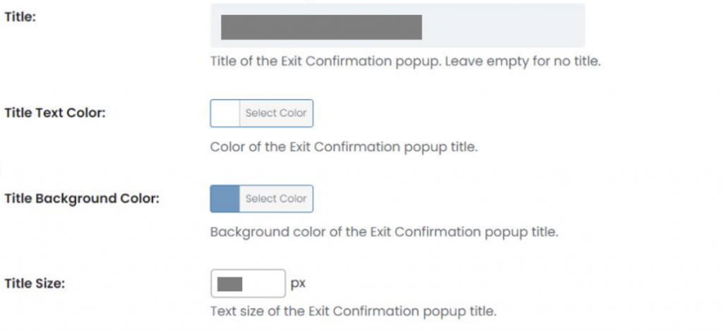
Next, choose a default title from a list or create your own. Either way, you can change the hue the same way you changed the background and then pick a different hue for the title’s background.
You can also change the size of the letters, but remember that they need to look right in context with the rest of your popup message, so you may want to come back to this step after you’ve settled on the overall size of your popup window.
Create a Catchy Popup Message
Next, you’ll have to write the text of your popup message. If you want the user to stay on your website, you can use your writing abilities to get creative here. Remember that this is just a popup message, so please don’t use this space to compose lengthy papers.
Customize the Text Color and Size

As expected, you can change the text’s font, size, and color. Although this may seem minor, it is still important because it has some aesthetic value, so double-check that the colors and font sizes all work well together.
Pick a Spot for the Popup Window
Once you’ve decided on a title and written out the body of the popup message, you can decide how big you’d like it to be. You can change the width of the popup and where it appears on the page. If the box for the tab’s height in the exit confirmation is left unchecked, the plugin will use its default height values.
Pick an Overlay Color
You can add an overlay to the website so that the popup message appears at the desired location when the external link is clicked. While translucent by default, the overlay color can be changed to something darker using the color picker to make your message stand out.
Build Your Own “I Want to Stay” Button

You have probably already fine-tuned everything. Now all you have to do is design a button that will make the user stay on your site. The default text for this button is “I wish to stay,” but you can change it to whatever you choose as long as it makes it clear that clicking it will not cause the user to leave the current page.
Summary
Complete control of your website’s links improves SEO and user experience. WP Links enables exit confirmations easy to activate, edit, and style, as illustrated in this post. You can control your website’s security, but you can’t ensure other websites’ security. Reminding the user that the content isn’t under your control can keep you out of trouble.

